- Subscribe to RSS Feed
- Mark Thread as New
- Mark Thread as Read
- Float this Thread for Current User
- Bookmark
- Subscribe
- Printer Friendly Page
No responsive template options to suit both desktop & mobile view??! This is the 21st century!
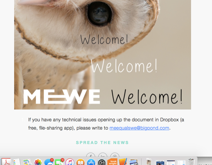
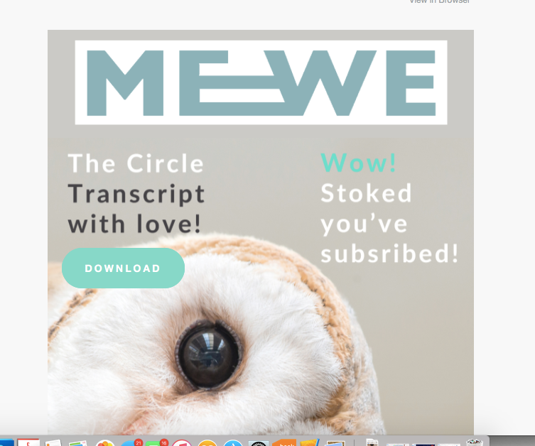
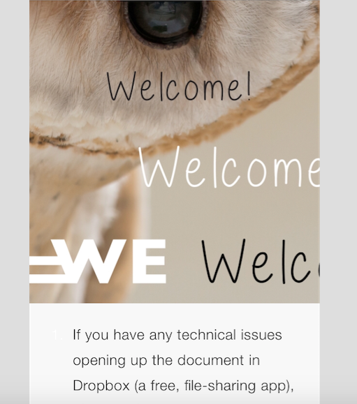
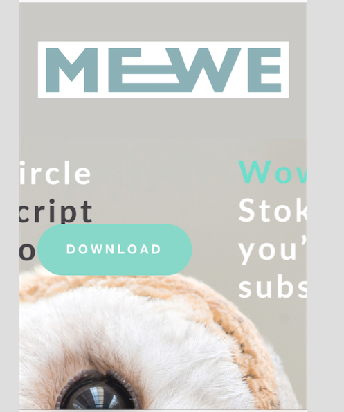
When trialling Promote, using the templates provided, I was unable to create an email that fitted both desktop AND the mobile view. I attempted around 30 times, getting more and more frustrated, to create a document that could be viewed on both a ‘desktop’ and a ’mobile’ phone. However I could not. This is obviously an extremely important feature in the modern day, to be able to send, for example, a welcome newsletter that is readable in both forms. On my computer, for example, my newsletter looks fantastic... On my mobile phone, it's all misaligned, rearranged and words and images are cut off. Also, as an aside, I couldn’t even reduce the size of the text using Promote..? So, I'm wondering is promote, in the very near future, going to offer a responsive template that can be viewed on both desktops and mobiles? It seems a must... a no brainer... it's archaic to be offering anything else....
- Mark as New
- Bookmark
- Subscribe
- Subscribe to RSS Feed
- Permalink
- Report
That's surprising, @JG2. I've seen quite a few Promote emails over the years and they've always looked fine to me on a mobile device. Could you get a screenshot of one where it looks bad? Also, what email application are you using on your phone?
- Mark as New
- Bookmark
- Subscribe
- Subscribe to RSS Feed
- Permalink
- Report
Hi Adam,
I couldn't fit the image into one screenshot so I had to divide it into two shots, hence 'lower' and 'upper' shots. As you can see the 'desktop' shots fit into the whole screen and the 'mobile' shots are cut off. I used the template provided and I played around with different size images in PS. The mobile view is cut off on iphones (old and new models) and I also tried with a Nokia 5 (last year's model). When uploading a background image into the template, can you please advise me the optimum image dimensions to be able to view the image in both desktop and mobile view? What do I need to do to successfully upload and edit an image that suits both views? What is it I am possibly doing wrong? Obviously everyone needs a newletter that can be read in both desktop and mobile view, otherwise person A. who opens it on a mobile will have a chatoic, cut off, non-sensical newletter and person B. will have a lovely, readable one. Am I not getting something? I'm perplexed as to why there is even an option of different views... A newsletter in this day and age 'has' to suit both views.
- Mark as New
- Bookmark
- Subscribe
- Subscribe to RSS Feed
- Permalink
- Report
You aren't doing anything wrong, @JG2; it can be tricky using background images because of the radically different screen ratio on mobile devices. If you rotate your phone to landscape you'll see that it's likely a little closer to how the desktop displays (I think it will still be zoomed in a little more since the dimensions are smaller, though).
Images are dynamically sized to fit whatever the screen size is, so as long as an image is large enough to fit the screen size the actual dimensions to affect much. When you have an image which is object-centric - meaning it has a specific focal point - it can be a little trickier to keep the size and positioning correct. The CSS of your theme doesn't know where the focal point is so it can't know how to position. All it will do is change the size of the image to fit the dimensions of the screen appropriately.
You can, however, sometimes override the CSS on a per-page or site-level basis on mobile devices to position it a little better. It's a little tricky and does require knowledge of CSS.
- Mark as New
- Bookmark
- Subscribe
- Subscribe to RSS Feed
- Permalink
- Report
Thank you for your feedback. So, in summary, creating/designing a newletter that fits both desktop and mobile devices is tricky. This isn't very reassuring... Are there future plans to make the templates and the view perspective less tricky?
My trial period ended (x 2 emails) ended so I cannot test any new methods out. I would like to know please if I could have an exteneded trial period to try out different methods of design and to know whether or not this is actually worth me paying for every months. I will only be sending myself 'test emails'. Would that be possible please?
And I have one other question please:
1. Could you please confirm that being able to change the size of the text is not possible - or am I mistaken? My expereince is - the templates only allow you to choose one set heading size, one set sub-heading size, one set text size etc. Will they be introducing new functionality for the templates soon e.g. being able to change the size of the text? And, being able to easily fit desktop and mobile devices without it being tricky.
I look forward to your reesponse. I appreciate your time and support.
- Mark as New
- Bookmark
- Subscribe
- Subscribe to RSS Feed
- Permalink
- Report
By tomorrow your limit of 2 campaigns a month should refresh, so you should be able to send another 2 email campaigns over the next month to further test out Promote (this will repeat again in another 30 days if you wanted to continue testing).
- Mark as New
- Bookmark
- Subscribe
- Subscribe to RSS Feed
- Permalink
- Report
Hi Adam,
Thanks for your time. Unfortunately I don't feel any solutions have been provided. Being able to send two more emails and then waiting 30 days doesn't give me time to attempt the only vague solution you've provided me that is "I may be able to sometimes override the CSS if I have CSS skills but it's tricky". And you haven't answered the two questions that I've now asked and alluded to several times - will Promote soom be releasing a template that is responsive i.e. readable in both desktop and mobile forms? And will I be able to change the lettering size using numbers?
I look forward to your response.
Sincerely
JG2
- Mark as New
- Bookmark
- Subscribe
- Subscribe to RSS Feed
- Permalink
- Report


