- Subscribe to RSS Feed
- Mark Thread as New
- Mark Thread as Read
- Float this Thread for Current User
- Bookmark
- Subscribe
- Printer Friendly Page
I love Square and like the POS and record keeping and invoicing and the integration and etc. but I am displeased with the situation with the Mobile Site display for the on-line store.
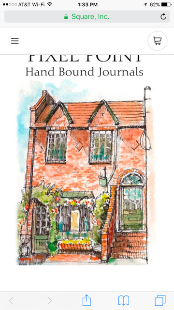
If you have tried this channel , then you know that the banner part of the site is a mess as the graphics do not display in a recognizable much less pleasing format. Even the Roebling Theme is ruined by the large opaque rectangle that is the background for any text that you place in that placeholder.
Yes, I could go to a Square partner and have yet another web site to deal with and lose the reuse of my product info and graphics but no thank you!
So, while Square works out their adaptive site tactics, I figured out a work-a-round that works for me:
1. Use the Roebling Theme
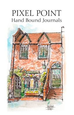
2. Use a graphic program to design a special custom graphic.
3. Specify a canvas size of 1144 px X 1785 px ( you must use these dimensions to force Square’s cropping to be the correct size on a mobile device display like an iPhone)
4. Create a pleasing graphic that also includes your text in a pleasing layout knowing that it is going to display nicely on the mobile device.
5. Save the graphic as a .jpg and upload that graphic in Square’s store editor
6. Make sure that the Headline is left blank in the editor window.
Now, there is a trade-off as the graphic is not going to look perfect on a desktop.view. If you are clever, you can design so that it has the info you want to display when Square does its cropping process. But remember the task for me was to look good on a mobile device as 85% plus of views are going to be on that platform and not a desktop.
If you would like to take a look, then please use this link on a mobile device and check it out. This works for the iPhone displays. I would love to hear about your experience using another type of phone and operating system.
https://squareup.com/store/pixel-point
- Mark as New
- Bookmark
- Subscribe
- Subscribe to RSS Feed
- Permalink
- Report
I don't use the website so I don't have any advice.
But it it didn't render correctly on my iPhone 7 plus. The "Pixel point" is pretty much cutoff exactly in half horizontally at the top. It did render ok on my wife's iPhone SE
- Mark as New
- Bookmark
- Subscribe
- Subscribe to RSS Feed
- Permalink
- Report
Thank you for checking!
I found this free mobile device simulator to better check on my approach. Just link to the site and give it the url of what you wish to check.
At least a few of the iPhone and Android devices can be checked. I will tweak my graphic dimensions to display pleasingly over the range I can check.
dan
- Mark as New
- Bookmark
- Subscribe
- Subscribe to RSS Feed
- Permalink
- Report
I understand that my playing with graphic sizes is not really responsive but, for the present, it provides me an interim solution.
Based on input from previous poster, I modified the image to work on the larger iphones and andriod devices but still work on the iphone 5 and 6 normal series.
If you would like to take a look, then please use this link on a mobile device and check it out. This works for the iPhone and Android displays. I would love to hear about your experience using another type of phone and operating system.
https://squareup.com/store/pixel-point
The new canvas size is 1144 x 1506
- Mark as New
- Bookmark
- Subscribe
- Subscribe to RSS Feed
- Permalink
- Report
@mckinney3 - Thanks for taking the time to share! 🙂
Sean
he/him/his
Product Manager | Square, Inc.
- Mark as New
- Bookmark
- Subscribe
- Subscribe to RSS Feed
- Permalink
- Report


