- Subscribe to RSS Feed
- Mark Thread as New
- Mark Thread as Read
- Float this Thread for Current User
- Bookmark
- Subscribe
- Printer Friendly Page
Thanks for sharing, @halcomic. I fixed the link in your post since it seem to have gotten a little messed up.
- Mark as New
- Bookmark
- Subscribe
- Subscribe to RSS Feed
- Permalink
- Report
Hi @halcomic,
congratulations on getting your site up and running. It looks good, particularly for a first attempt.
I'd like to offer a few observations that you can take on board, or ignore them if you wish. I don't mean to come across as nasty, just trying to give you some advice as you asked for our thoughts.
The first thing that happened as I scrolled down your page was I was met with a pop-up asking me to join a mailing list. That is a pet hate of mine and a lot of people I know. There maybe a better option than a pop up - perhaps join-up form in the footer of your pages.
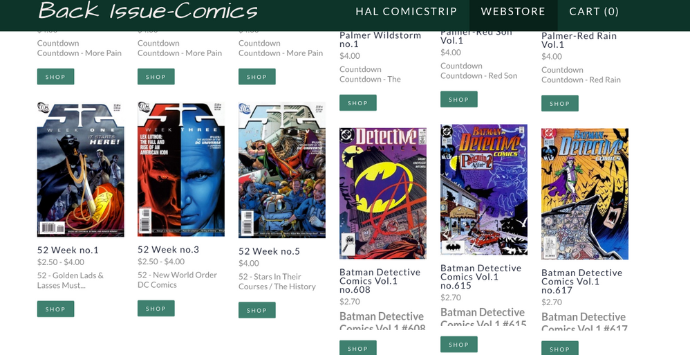
The layout of some pages is inconsistent so it makes the page look messy. The content of the pages is all relevent but you could do well to spend a little more time on spacing and alignment. For example, is it possible to align these items so they're not staggered and missing text? Putting a spacer across the width of the page under each row could help.
The other thing that could be improved is your spelling and punctuation. There are many instances throughout the site. As a website that is trying to sell things, you need your customers to feel like you can be trusted; to correctly address a shipment for example. The errors in spelling and punctuation give off the impression that you don't care about the 'little' things. It's the little things that make a business succeed.
For example: Your menu has a page called 'About US' - should probably be 'About Us' unless you are referring to the United States. The page title in my browser tab has 'About us' which is probably the best option as 'us' doesn't need a capital 'U'. Try to be consistent at least.
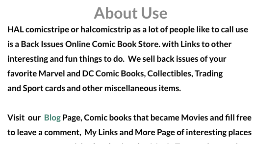
On the actual 'About Us' page the heading is 'About Use' - I gather you're not talking about the use of your web site. The first sentence uses the word 'use' again where I think you meant 'us', then you have a '.' at the end of the word 'Store.' but the sentence continues on. In the next paragraph you've invited people to 'fill free to leave a comment'. The word should be 'feel' free to leave a comment. Maybe if English is not your first language, you can find a friend of collegue to proof-read your site. Sometimes it's very difficult to find errors in your own text as you read it as you intend it, not as it is.
The last thing I'd like to suggest is that you ensure all images and icons used on your site are clear and not pixelated. The Superman image you have used as your main 'logo' is quite blurry on my screen. I'm sure you can source a better one, although I'd be careful about using that image anyway unless you have permission from the owners of the Superman franchise - they could sue you unless you have permission - particularly as you are selling items related to that. It's okay to use the image I think, just not as your logo.
Once again, I'm sorry if you think I'm being too critical, but I think fixing those things will indicate a professionalism that is going to set your website apart from the others.
I wish you best of luck with the website and many sales!
Cheers,
Mark
- Mark as New
- Bookmark
- Subscribe
- Subscribe to RSS Feed
- Permalink
- Report
- Mark as New
- Bookmark
- Subscribe
- Subscribe to RSS Feed
- Permalink
- Report


