- Subscribe to RSS Feed
- Mark Thread as New
- Mark Thread as Read
- Float this Thread for Current User
- Bookmark
- Subscribe
- Printer Friendly Page
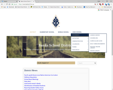
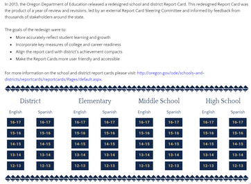
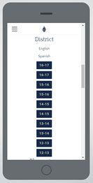
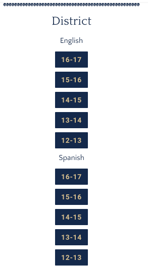
Hey all! We've been using Weebs for about 2-3 years now and for the most part things have been fine for our needs (with the exception of no spreadsheet functionality and a few other minor annoyances). The web version of the site looks the way we expect it to. However, after re-structuring the navigation, the mobile version is a mess! It has become nearly impossible to navigate. I have tried editing the code directly, but no matter what I change, it makes zero difference. The links have become a sea of white background / black font spam.. There is no way to discern what you're looking at... For example, If I fan out the District main nav, there is nothing that separates those links from the next page (Elementary), etc.
I've tried modifying colors, borders, sizes, etc. Nothing seems to take. ??? In the css editor I searched for mobile-nav and have tried all sorts of mods to no avail....
Am I missing something simple or is this a larger Weebly issue? Any help would be appreciated. I'm not sure what theme we started with anymore (it is "responsive" though), as the limitations of the Weebly UI have forced me to customize a lot of it..
Our domain is www.banks.k12.or.us
Bonus points: Under the "District News" call out box, there are 2 spacers. If I delete one, it creates a new one, plus keeps the spacer I "deleted". Every time. I have logged out, logged back in and retried to no avail. I have tried adding other elements in between and around these mystery spacers, yet no matter what, if I delete one, it creates another....!!
- Mark as New
- Bookmark
- Subscribe
- Subscribe to RSS Feed
- Permalink
- Report
Sorry for the trouble, @ccruess. Every theme handles the mobile navigation a little differently - you might find it easier to just switch to a different theme and see if the styling is more to your liking.
Regarding the spacer issue, drag the spacer into a column with another spacer, then click on a vertical divider between them and delete the columns element itself. This should delete the spacers with any of them re-appear or duplicating.
- Mark as New
- Bookmark
- Subscribe
- Subscribe to RSS Feed
- Permalink
- Report
Adam,
Moving the spacer to a different column actually created a new full width spacer above the originals. However, after playing around with your suggestion for awhile, I was able to successfully delete all of the unneeded spacers. Thanks +1 for that!
"Just switch to a different theme" - I have several issues with this suggestion:
1) This site has 100+ pages and is in production. I cannot just switch the layout / look of the site. We are a public school district, which means any change requires meetings / approvals, etc.
2) There is no way to "preview" the mobile version of the theme. The option simply does not exist.
- Also, when editing code, there is no way to have the mobile view open.
If there is truly no way to edit the mobile version of the site, unfortunately, we will have to consider another host. More and more staff / students / parents are ONLY using the mobile site. ![]() We are not alone in this: see any other forum post about mobile. Weebly needs to step their mobile game up. It is ridiculous that we cannot edit the mobile version of the site. There is no way to do this? We can't even modify menu color, font, anything? Even with code? I'd much prefer to find a way to solve this than to migrate and redesign again...
We are not alone in this: see any other forum post about mobile. Weebly needs to step their mobile game up. It is ridiculous that we cannot edit the mobile version of the site. There is no way to do this? We can't even modify menu color, font, anything? Even with code? I'd much prefer to find a way to solve this than to migrate and redesign again...


- Mark as New
- Bookmark
- Subscribe
- Subscribe to RSS Feed
- Permalink
- Report
Since the mobile site has been shoved into the spotlight this week, I have come to realize that this problem is MUCH MUCH bigger than the navigation being messed up. Essentially the entire site looks like garbage on mobile. The way Weebly automatically "translates" columns into stacking ruins pretty much all of our 100+ pages. There are a few I've thought look "OK", which is hardly acceptable for a paid service. For example:


If Weebly cannot provide a reasonable solution or suggestion other than "switch your theme". We will be forced to move onto another provider.
Please help! WE NEED TO BE ABLE TO EDIT THE MOBILE SITE SEPARATELY FROM THE PC/Web VERSION!!!!! Am I missing something or is Weebly???
- Mark as New
- Bookmark
- Subscribe
- Subscribe to RSS Feed
- Permalink
- Report
Hi @ccruess It looks like that is due to the way the elements were arranged into columns. I made a copy of the page you posted (it's at the very bottom of your page list) and have rearranged the elements into the correct stack. When you edit these pages I highly suggest making a copy of the page first and then edit the copy page. Once you are happy with the changes you can replace the page and delete the original. Unfortunately, if it is the majority of your pages doing this then it is probably going to take some time to edit them all. ![]() I'm really sorry!
I'm really sorry!
I tried to get a screengrab and screenshots for you to show you what I mean by element stacking, but this example was a little complex. Is there another page that has less content not displaying properly in the mobile columns?
- Mark as New
- Bookmark
- Subscribe
- Subscribe to RSS Feed
- Permalink
- Report
@ccruess: Most of the time site not showing good on mobile is the designer's fault - people don;t think of 'mobile first' as a first step in designing websites. No generic drag and drop program can handle all the possibilities. Weebly has generic media queries. May be in your case you need to implement some specific targeted media queries.
- Mark as New
- Bookmark
- Subscribe
- Subscribe to RSS Feed
- Permalink
- Report
@Bernadette That is definitely a step in the right direction. However, how are we supposed to know which columns or stacks will translate correctly? This example page is on the small side as far as content... The staff directory pages and board policies are a nightmare... There aren't enough hours in the day for me to go through all of these pages to guess and check the column alignment.
@bobafett You are correct. We did not design the site "mobile first". However, it is still ridiculous that we cannot edit the mobile version of the site separately. We cannot have the mobile view open while editing code, plus you cannot preview the effect of theme changes on mobile. Also, we cannot see both desktop/mobile views at the same time.
Either way, is there truly no way to adjust color / font, etc for the mobile navigation? I'm thinking in this situation it might be better to simply disable the mobile version of our site all together until we can find a more permanent solution.
- Mark as New
- Bookmark
- Subscribe
- Subscribe to RSS Feed
- Permalink
- Report
In a columns element, the left side column always stack on top of the right side. Usually the best solution is to move contents into separate columns elements, that way side-by-side content stacks in an order that makes sense on mobile.
As for changing the mobile navigation color, this would need to be done via CSS customization right now. Are you familiar with that at all?
- Mark as New
- Bookmark
- Subscribe
- Subscribe to RSS Feed
- Permalink
- Report
@ccruess: There is way you can see how your site looks on mobile. I use chrome to view the sites on different devices. If you right click a page and then click inspect (first time you use it there is an icon - second from left that says device toggle bar) If you click it, you will be able to see how the site looks on many different devices. Hope that helps.
It is still not 100% accurate, but 95%.
There is also a free APP called column lock. I have not used it, but that is something that may be of use to you.
- Mark as New
- Bookmark
- Subscribe
- Subscribe to RSS Feed
- Permalink
- Report
@Adam That makes sense. Yes, I am fine with editing CSS. There is only one section for mobile-nav, but editing code there makes zero difference. What am I missing?
@bobafett I meant within the Weebly UI, for example- If I'm editing our home page, it'd be really handy to have the mobile and desktop views open side by side instead of having to switch back and forth. That inspect / device tab is a nifty little trick though, instead of pulling out my phone, ipad, etc. I'll definitely play around with it.
- Mark as New
- Bookmark
- Subscribe
- Subscribe to RSS Feed
- Permalink
- Report
It's possible it's being overwritten by other CSS; we have CSS that is loaded for sites that isn't included in what you see when editing a theme. For a lot of people it's easier to look at the rendered code on the live site to find what rules are doing what.
- Mark as New
- Bookmark
- Subscribe
- Subscribe to RSS Feed
- Permalink
- Report
So the question remains... how can I edit the mobile nav?
- Mark as New
- Bookmark
- Subscribe
- Subscribe to RSS Feed
- Permalink
- Report
If you're doing it via CSS, you'd need to add CSS further down that overrides whatever the last rules applied are. I'd say the most sure-fire way to do that is to add the to the Footer Code field in Settings > SEO and wrap them in style tags, e.g.
<style>
.menu-item {.color: #fff; }
</style>
- Mark as New
- Bookmark
- Subscribe
- Subscribe to RSS Feed
- Permalink
- Report

